Being able to visualize data is one of the most important skills for a data scientist to have. We can use visualizations to easily communicate our findings to non-data scientists much more easily. In these next posts, we're going to learn how to effectively use matplotlib to further these skills. The matplotlib mini-tutorial will be split into four key sections:
All of the code in this tutorial can be found here.
Let's start by generating some random numbers to plot:
import random
data = random.sample(range(100), 10)
print(data)
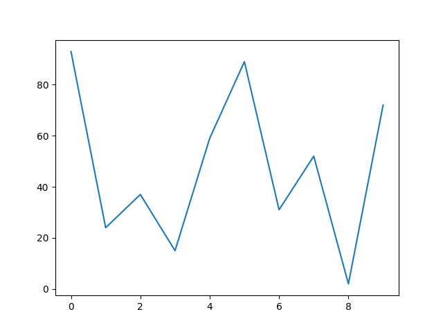
Now let's plot the data:
import matplotlib.pyplot as plt

fig, ax = plt.subplots()
ax.plot(data)

plt.show()

We start by importing the pyplot interface from matplotlib, which provides the basic plotting functionality, (we gave it the alias plt, which is practically always done in practice, we will be seeing many similar aliases throughout this tutorial).
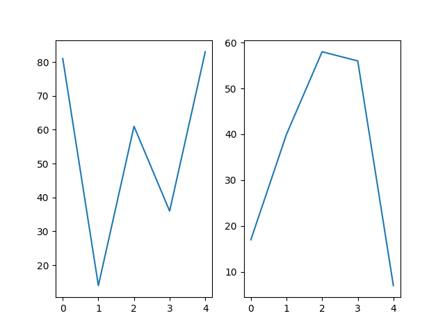
Next, we call pyplot's subplots method, which returns a Figure and an Axes object. The Axes contain everything you can see in the plot, both the x and y axis, the tickmarks, the line itself, etc. It's reasonable to think as encapsulating everything that makes up the plot. The Figure is simply the container the plot is in. One Figure can contain multiple plots:
data1 = random.sample(range(100), 5)
data2 = random.sample(range(100), 5)
print(f'data1: {data1}, data2: {data2}')
fig, (ax1, ax2) = plt.subplots(1, 2)
ax1.plot(data1)
ax2.plot(data2)
plt.show()

So we've created a single Figure to house two Axes (i.e. two separate plots)
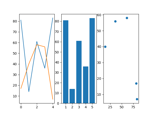
It's important to note that while so far we've been creating line plots, matplotlib is capable of much more, let's demonstrate by re-plotting the previously generated data:
fig, (ax1, ax2, ax3) = plt.subplots(1, 3)
ax1.plot(data1)
ax1.plot(data2)
bar_labels = ['1', '2', '3', '4', '5']
ax2.bar(bar_labels, data1)
ax3.scatter(data1, data2)
plt.show()

We've just begun to scratch the surface of the types of plots that can be made with matplotlib (full list here). In the next tutorial we'll delve deeper into different plots we can make, as well as how to further customize those plots.
Posted: 2023-04-09