In the previous post we learned the basics of plotting with matplotlib. Now we'll move onto the second key section, Customization.
All the code from this post can be found here
Let's start with a quick review of basic plotting, this time we'll compare annual headline consumer price inflation source: World Bank from 2017 to 2022 in the United States and Canada.
import matplotlib.pyplot as plt
united_states = [2.14, 2.44, 1.81, 1.23, 4.70]
canada = [1.60, 2.27, 1.95, 0.72, 3.40]
fig, ax = plt.subplots()
ax.plot(united_states)
ax.plot(canada)
plt.show()
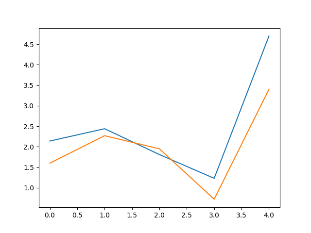
As it stands, this plot has several problems. It's missing a title, axis labels, and a legend, making the plot completely meaningless on its own. Fortunately, customization of plots is a core feature of matplotlib. Let's start by rectifying these issues.
ax.plot(united_states, label="United States")
ax.plot(canada, label="Canada")
ax.set_title('Inflation in The United States vs. Canada')
ax.set_xlabel('Year')
ax.set_ylabel('Percent')
ax.legend()
plt.show()
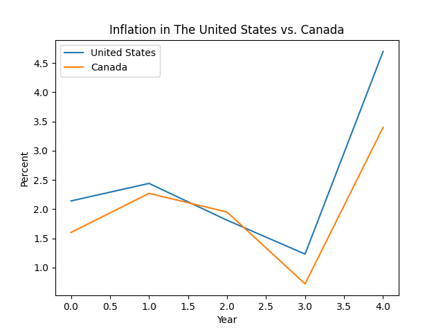
This is looking much better, there's one final step in converting this into a competent plot, and that's converting the numbers of the x-axis to show the appropriate year, instead of the default 0.0, 0.5, etc.
years = [2017, 2018, 2019, 2020, 2021]
ax.plot(years, united_states, label='United States')
ax.plot(years, canada, label='Canada')
ax.set_xticks(years)
ax.set_xticklabels(years)
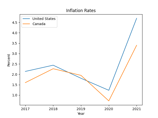
We've now fully constructed a figure that, if nothing else, at least wouldn't fail a fourth-grade math class.
Notice that we've once again re-defined the plot() statements, this time with two positional arguments: years and united_states/canada. When the plot() method is called with one positional argument, as we've done up until this point, it's assumed that argument is the y-values of the data to be plotted, and the x-values are set to len([y]). This is why the x-axis of the earlier plots simply ranged from 0 to 4.
When called with two positional arguments, the first is set to the x-values, and the second to the y-values.*
We've seen how add basic supplemental information to a plot, now let's make this plot truly ours. We can start by changing the lines:
ax.plot(years, united_states, color='blue', linewidth=2, label='United States')
ax.plot(years, canada, color='red', linewidth=2, label='Canada')
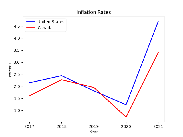
To change the line color and thickness, simply specify your desired values when calling plot(). In fact, not only can you change just about anything about these lines, the same is true for the entire plot!
# let's set some colorblind-friendly colors
US_COLOR = '#3182bd' # blue
CA_COLOR = '#de2d26' # red
ax.plot(years, united_states, color=US_COLOR, linewidth=2, label='United States')
ax.plot(years, canada, color=CA_COLOR, linewidth=2, label='Canada')
# get rid of some clutter
ax.spines['top'].set_visible(False)
ax.spines['right'].set_visible(False)
# add some horizontal gridlines
ax.yaxis.grid(color='gray', linestyle='dashed')
ax.set_title('Inflation in the United States and Canada', weight='bold')
ax.set_xlabel('Year', weight='bold')
ax.set_ylabel('Percent', weight='bold')
# add a subtitle
ax.text(0.5, 0.98, 'Average annual headline consumer price inflation (source: World Bank)', transform=ax.transAxes, ha='center', fontsize=8)
# adjust interval on x-axis
ax.set_xticks(years)
ax.set_xticklabels(years)
ax.legend(loc='lower left')
plt.show()
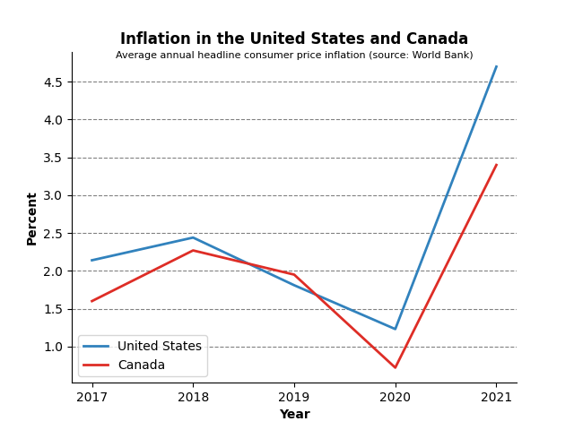
Now that is a plot!
There is much more customization you can do; as mentioned, just about everything can be configured in a matplotlib plot. In the next post we're going to cover how to use the matplotlib api to fully unlock our potential!
If your data are already labeled, say in a dict or a pandas dataframe, you can take advantage of the data parameter in the plot() method. This provides a more convenient way of inserting the labels into the plot:
import matplotlib.pyplot as plt
united_states = [2.14, 2.44, 1.81, 1.23, 4.70]
years = [2017, 2018, 2019, 2020, 2021]
us_dict = {'Year': years, 'Percent': united_states}
fig, ax = plt.subplots()
ax.plot('Year', 'Percent', data=us_dict)
plt.show()
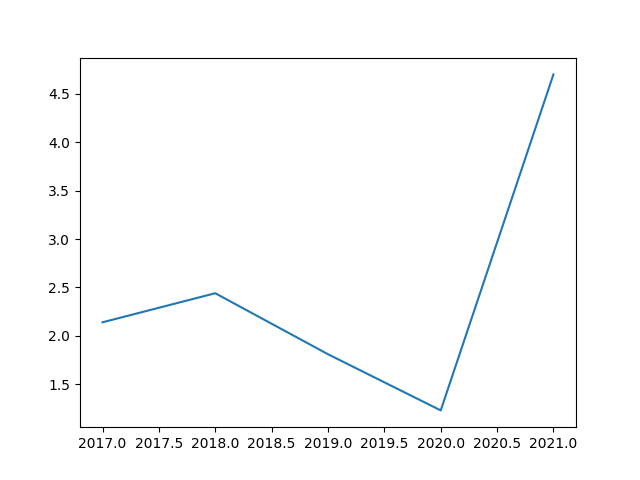
So there is no need to 'pull apart' the data into separate lists for data and labels.
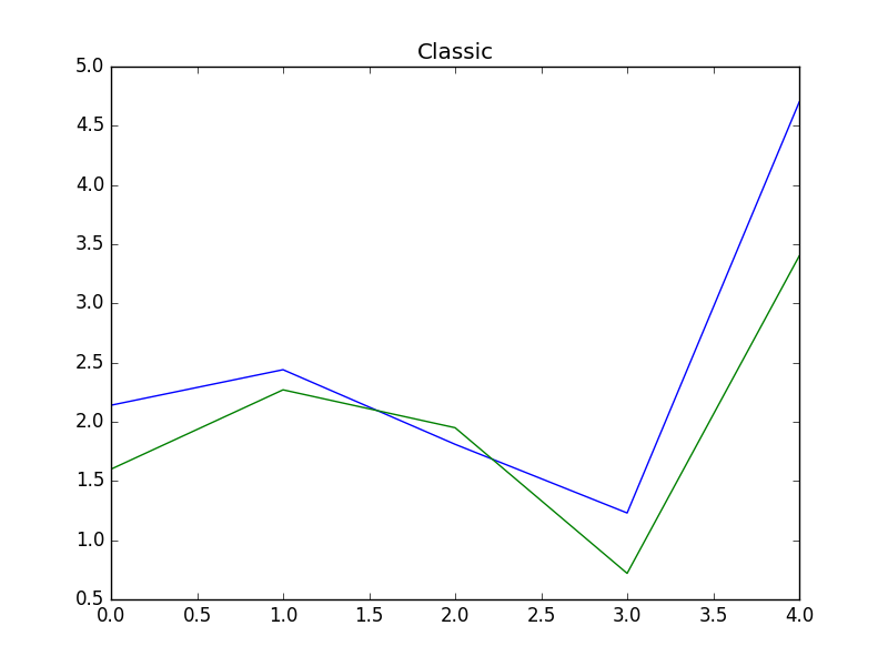
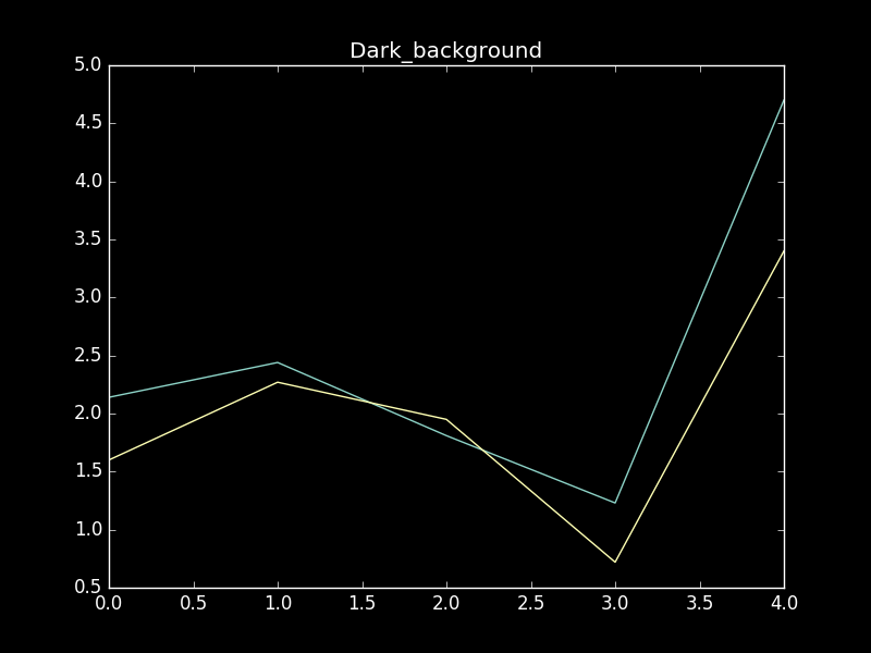
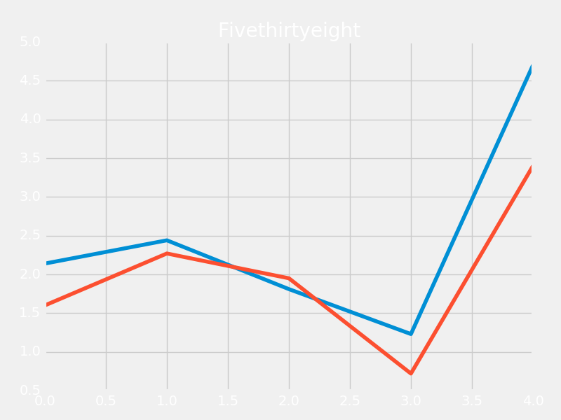
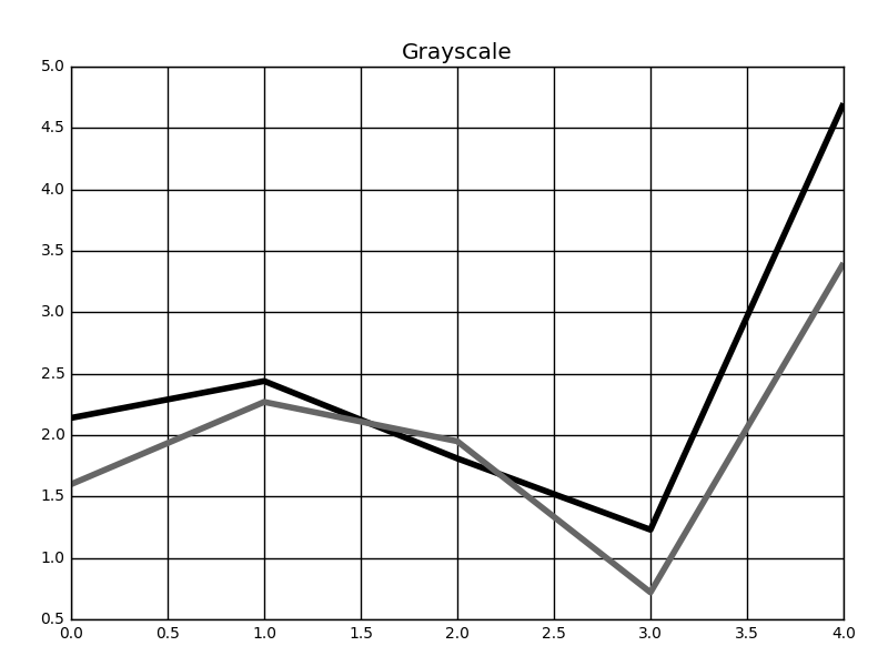
It's also worth mentioning that matplot lib contains a large number of 'pre-built' styles, so if you want your plot to stand out, but also don't want to spend time tweaking all the details, you can try one of those! It's as simple as running
plt.style.use('classic')
Here are a couple interesting examples:
Posted: 2023-04-10