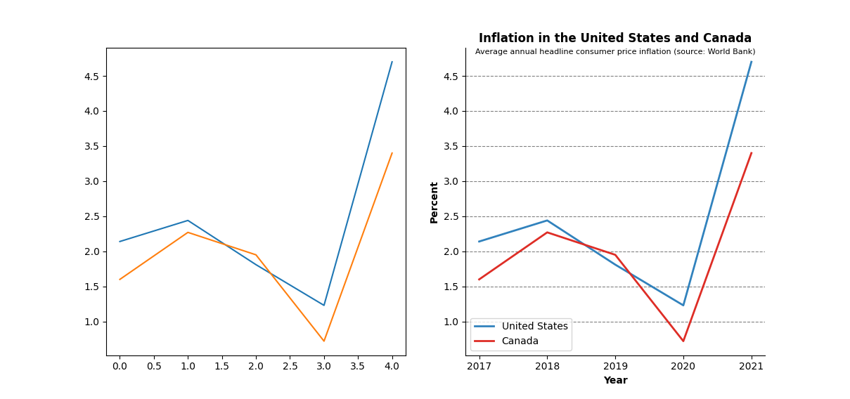
Welcome to the section covering the matplotlib API, from this point on, things are going to get a lot more intense (and fun), and the explanations will be much more of a broad overview, rather than a careful explanation. Your understanding of Basic Plotting and Customization will need to be rock-solid in order to keep up.
In the previous post we delved deeper by customizing plots, and we converted a simple collection of lines and axes into a truly effective visualization of data.

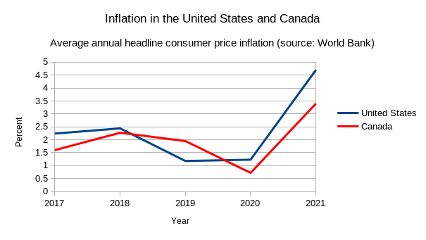
Critical readers however, may be thinking "Hey this is great and all, but I can do this just as easily in something like Excel". That would be a fair criticism, in fact, here's a plot I created using LibreOffice Calc in about 30 seconds.

It's true that up until this point everything we've done could be done in your typical spreadsheeting software (and it'd probably be a lot faster too). That's all about to change; in this post we're going to learn how to use the matplotlib APplication Interface (API) to do some truly interesting things with plots.
All the code from this post can be found here
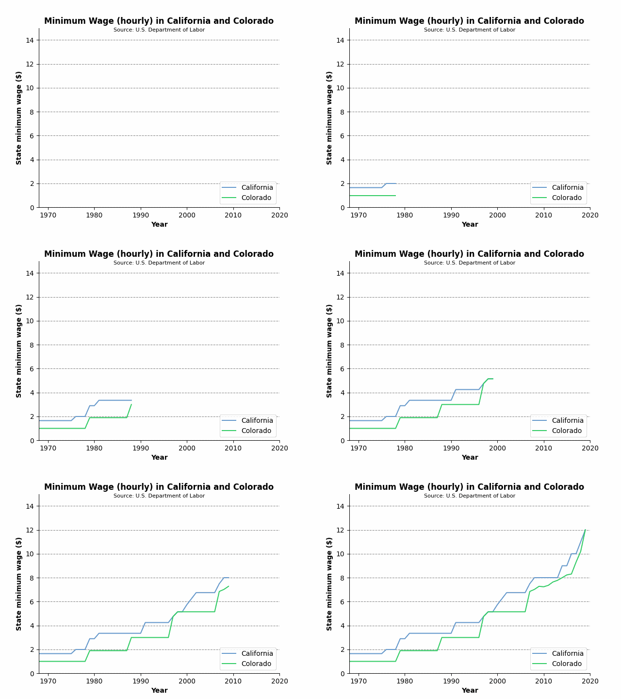
We can add a little pizzazz to our plots by animating them, let's demonstrate by plotting the minimum wage in the states of California and Colorado over time (data source).

This is not a pandas tutorial, so I'm going to just hand wave the following code as 'pre-processing' the data. However, I will be writing a pandas tutorial soon.
import matplotlib.pyplot as plt
import pandas as pd
DATA_LOC = '../not_my_data/Minimum Wage Data.csv'
df = pd.read_csv(DATA_LOC, encoding='Windows-1252')
years = pd.unique(df['Year'])
california = list(df.loc[df['State'] == 'California', 'State.Minimum.Wage'])
colorado = list(df.loc[df['State'] == 'Colorado', 'State.Minimum.Wage'])
Now we'll add some styling as we did previously:
CA_COLOR = '#6699CC' # blue
CO_COLOR = '#33CC66' # green
fig, ax = plt.subplots()
ax.set_title('Minimum Wage in California and Colorado', weight='bold')
ax.text(0.5, 0.98, 'Source: U.S. Department of Labor', transform=ax.transAxes, ha='center', fontsize=8)
ax.set_xlabel('Year', weight='bold')
ax.set_ylabel('State minimum wage ($)', weight='bold')
ax.spines['top'].set_visible(False)
ax.spines['right'].set_visible(False)
ax.yaxis.grid(color='gray', linestyle='dashed')
ax.set(xlim=[years[0], years[-1]], ylim=[0, 15])
ca_line = ax.plot(years, california, color=CA_COLOR, label='California')
co_line = ax.plot(years, colorado, color=CO_COLOR, label='Colorado')
ax.legend(loc='lower right')
I'm going to explain how to create the animation in a top-down fashion here. The final statement that we'll run is:
ani = animation.FuncAnimation(fig=fig, func=update, frames=len(years), interval=30, repeat=True)
The FuncAnimation class creates animations by stitching frames that are created by whatever we pass into the func parameter. The interval parameter specifies how many milliseconds to wait between each frame. fig is simply the Figure to animate and repeat will loop the animation if true.
So we need one frame for each data point (i.e., each year in our data). Creating the initial frame is simple, given that the pyplot.plot() method actually returns a list of Line2D objects, one for each point on the line, we can construct the first frame by simply using the first point on each line:
ca_line = ca_line[0]
co_line = co_line[0]
Now all that's left is for us to define a function to create subsequent frames, and pass that into the func parameter of FuncAnimation. This function is as simple as:
def update(frame):
    ca_line.set_xdata(years[:frame])
    ca_line.set_ydata(california[:frame])
    co_line.set_xdata(years[:frame])
    co_line.set_ydata(colorado[:frame])
return (ca_line, co_line)
So putting it all together leaves us with:
ca_line = ca_line[0]
co_line = co_line[0]
INTERVAL = 30
SECONDS_BETWEEN_REPEAT = 2
FRAMES = len(years) + int((SECONDS_BETWEEN_REPEAT*1000)/INTERVAL)
def update(frame):
    if frame < FRAMES:
        ca_line.set_xdata(years[:frame])
        ca_line.set_ydata(california[:frame])
        co_line.set_xdata(years[:frame])
        co_line.set_ydata(colorado[:frame])
return (ca_line, co_line)
ani = animation.FuncAnimation(fig=fig, func=update, frames=FRAMES, interval=INTERVAL, repeat=True)
plt.show()
Note that I have added extra frames to create a delay before the animation loops. This is not necessary, but I think it looks better than allowing the animation to immediately restart the moment it completes.
By combining animation with the fact that we can customize just about anything with a matplotlib plot, we can create some truly interesting and unique visualizations:
Let's breakdown how I made this. Again, I will 'hand-wave' importing and pre-processing the data:
import matplotlib
import numpy
# unfortunately the data did not contain federal data, so I'm hard-coding
federal_min_wages = [1.6, 2.0, 2.0, 2.0, 2.0, 2.0, 2.0, 2.1, 2.3, 2.65, 2.65,
2.9, 3.1, 3.35, 3.8, 3.8, 3.8, 3.8, 3.8, 3.8, 3.8, 3.8, 3.8, 4.25, 4.75, 4.75,
4.75, 4.75, 4.75, 5.15, 5.85, 5.85, 5.85, 5.85, 5.85, 5.85, 5.85, 5.85, 5.85,
5.85, 6.55, 7.25, 7.25, 7.25, 7.25, 7.25, 7.25, 7.25, 7.25, 7.25, 7.25, 7.25,
7.25]
DATA_LOC = '../not_my_data/Minimum Wage Data.csv'
df = pd.read_csv(DATA_LOC, encoding='Windows-1252')
state_names = pd.unique(df['State'])
years = pd.unique(df['Year'])
num_years = len(years)
states = {}
for state_name in state_names:
    min_wage_data = list(df.loc[df['State'] == state_name, 'State.Minimum.Wage'])
    if np.allclose(min_wage_data, 0):
        continue
states[state_name] = list(df.loc[df['State'] == state_name, 'State.Minimum.Wage'])
states = dict(sorted(states.items(), key=lambda item: item[0], reverse=True))
average_wages = []
for year in years:
   wages = np.average(np.array(df.loc[df['Year'] == year, 'State.Minimum.Wage']))
   average_wages.append(wages)
We've created a dictionary called states which contains each state name (sans Alabama, Louisiana, Mississippi, South Carolina, and Tennessee) and a list of their minimum wage history. We also have the average minimum wage for each year in average_wages. Now let's go ahead and create and customize our plot:
COLOR_RED = '#DE2D26'
COLOR_BLUE = '#6699CC'
COLOR_GREEN = '#33CC66'
fig, ax = plt.subplots()
ax.set_xlim([0, 15])
ax.set_xlabel('Hourly Minimum Wage ($)', weight='bold')
ax.set_ylabel('State, Territory, or District', fontsize=12, weight='bold')
ax.set_title('Minimum Wage in The United States', weight='bold')
def currency(x, pos):
    return f'${x:.2f}'
ax.xaxis.set_major_formatter(currency)
fig.text(0.80, 0.00, '*Alabama, Louisiana, Mississippi, South Carolina,\nand Tennessee have no minimum wage laws', ha='center')
txt = ax.text(0.92, 0.96, f'Year: {years[0]}', transform=ax.transAxes, weight='bold', fontsize=16)
ax.spines['top'].set_visible(False)
ax.spines['right'].set_visible(False)
ax.xaxis.grid(True, linestyle='--', color='gray', alpha=0.4)
starting_min_wages = [x[0] for x in states.values()]
state_names = list(states.keys())
bars = ax.barh(state_names, starting_min_wages)
Most of this should look familiar if you read the customization post. One new addition is the call to Axis.set_major_formatter using the currency function we wrote, which simply formats a given string with a dollar sign and two decimal places. Notice the additional pos argument in currency(), which is required by the FuncFormatter class that the set_major_formatter() method is using.
Finally, whereas up to this point we've been mostly calling the Axes.plot() method to create line plots, we are this time using Axes.barh to create a horizontal bar chart. Also notice that like in the previous animation plot, we need to start with the 'initial data' to construct the first frame. Next, we're going employ the API more to create a vertical line and a custom legend:
starting_federal_min_wage = federal_min_wages[0]
federal_line = ax.axvline(starting_federal_min_wage, ls='--', linewidth=2, color=COLOR_GREEN, label='Federal')
blue_patch = matplotlib.patches.Patch(color=COLOR_BLUE, label='Above Average')
red_patch = matplotlib.patches.Patch(color=COLOR_RED, label='Below Average')
ax.legend(handles=[blue_patch, red_patch, federal_line], loc='lower right')
We're using the Axes.axvline method to insert a vertical line at the value of the Federal minimum wage, this method returns a Line2D object, exactly as our previous plot() calls did, so we can style it exactly the same way!
Unlike with previous plots, the legend we want is is not simply comprised of the data labels. We need to indicate what the significance of a blue bar vs a red bar is. Luckily, the API allows to simply create a red and blue rectangle (or Patch, as matplotlib calls them) and insert them into a custom legend
At long last, we can write our update() function and pass it into FuncAnimation(), as we did for the California vs. Colorado plot.
INTERVAL = 250
SECONDS_BETWEEN_REPEAT = 1
FRAMES = num_years + int((SECONDS_BETWEEN_REPEAT*1000)/INTERVAL)
def update(frame):
    if frame < num_years:
        txt.set_text(f'Year: {years[frame]}')
        federal_line.set_xdata([federal_min_wages[frame]])
        average_wage = average_wages[frame]
        for i, rectangle in enumerate(bars.patches):
            state = state_names[i]
            min_wage = states[state][frame]
            rectangle.set_width(min_wage)
            if min_wage < average_wage:
                rectangle.set_color(COLOR_RED)
            else:
                rectangle.set_color(COLOR_BLUE)
return bars.datavalues
ani = animation.FuncAnimation(fig=fig, func=update, frames=FRAMES, interval=INTERVAL, repeat=True)
plt.show()
Just as before, we're creating an individual frame for each data point using the update() function, and stitching them together using FuncAnimation(). With each new data point, we're updating the width of the horizontal bars, as well as the x-position of the vertical bar indicating federal minimum wage. We've also added some additional logic, if a state's minimum wage falls below the average minimum wage, we set the color of its bar to red, otherwise, we set the color to blue.
Voila! We now know how to take advantage of the matplotlib API to make animated plots! There is is just one example of how to use the API, there are several interesting examples in matplotlib's official documentation. It should be clear by now that the sky is the limit, anything and everything you can see on a plot can be fully customized, making anything you can dream of possible.
Posted: 2023-04-12