We now have a solid understanding of how to use matplotlib to create fully customizable plots. I've put together a series of exercises to help test your understanding. With each question, I've added a sample Figure displaying a correct solution, as well as one or more hints to help guide you. Good luck!
Please note, that not all the answers to these questions can be found within this tutorial, that's because this tutorial was never meant to exhaustively cover everything matplotlib, rather it was intended to provide foundational skills. To solve these questions, you'll likely need to use the matplotlib official reference.
All the code from this post can be found here
For brevity, assume these statements are included with every solution:
import matplotlib.pyplot as plt
import numpy as np
rng = np.random.deafult_rng(101) # not strictly necessary!
fig, ax = plt.subplots()
COLOR_BLUE = '#1F77B4'
COLOR_ORANGE = '#FF7F0E'
COLOR_GREEN = '#2CA02C'
COLOR_PURPLE = '#9467BD'
Many of these plots use randomly generated data, if you want your plots to look like mine, you can set the seed of the random generator to 101 as I have done.
1: Create a scatter plot using two datasets each consisting of 100 random data
points with values between 0 and 1. Use different marker styles and colors for
each dataset. Add a title and legend to the plot.
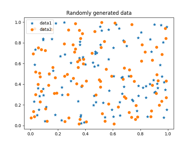
rng = np.random.default_rng(101)
data1 = rng.random((2, 100))
data2 = rng.random((2, 100))
ax.scatter(*data1, marker='*', label='data1') # *data1 = (data1[0], data1[1])
ax.scatter(*data2, marker='o', label='data2')
ax.set_title('Randomly generated data')
ax.legend()
plt.show()
2: Create a pie chart with the following data: sizes = [25, 20, 45, 10] and labels = ['A', 'B', 'C', 'D']. Customize the colors and explode the 'D' slice.
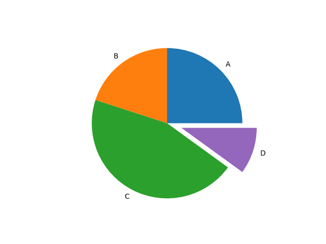
sizes = [25, 20, 45, 10]
labels = ['A', 'B', 'C', 'D']
explode = [0, 0, 0, 0.2]
colors = [COLOR_BLUE, COLOR_ORANGE, COLOR_GREEN, COLOR_PURPLE]
ax.pie(sizes, explode=explode, labels=labels, colors=colors)
plt.show()
3: Create a subplot with a 2x2 grid, displaying a line plot, scatter plot, bar plot, and histogram using randomly generated data. Customize each plot with a title and appropriate colors, and add a title to the Figure.
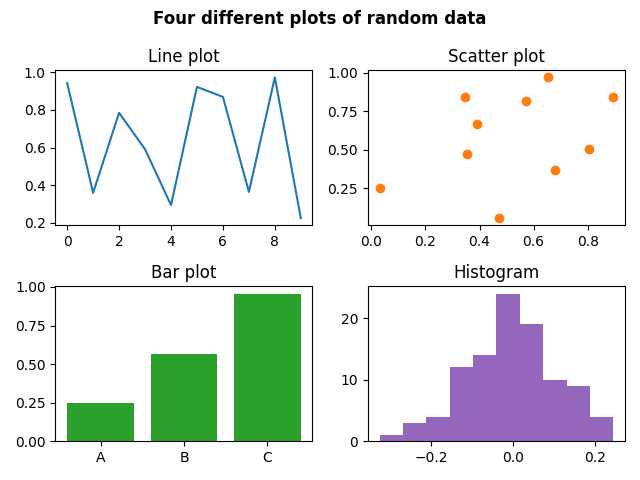
fig, axs = plt.subplots(2, 2, tight_layout=True)
line_data = rng.random((10,))
scatter_data = rng.random((2, 10))
bar_data = rng.random((3,))
bar_labels = ['A', 'B', 'C']
hist_data = rng.normal(0, 0.1, 100)
fig.suptitle('Four different plots of random data', weight='bold')
axs[0][0].set_title('Line plot')
axs[0][0].plot(line_data, color=COLOR_BLUE)
axs[0][1].set_title('Scatter plot')
axs[0][1].scatter(*scatter_data, color=COLOR_ORANGE)
axs[1][0].set_title('Bar plot')
axs[1][0].bar(bar_labels, bar_data, color=COLOR_GREEN)
axs[1][1].set_title('Histogram')
axs[1][1].hist(hist_data, color=COLOR_PURPLE)
plt.show()
4: Create a bar plot representing the average sales of a company across four quarters in a year. Add error bars to show the standard deviation. Add a title, labels, custom colors, and a legend.
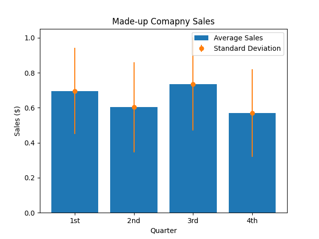
sales = rng.random((12,)) # 12 months in a year
quarter_len = len(sales) // 4
quarters = [sales[i:i+quarter_len] for i in range(0, len(sales), quarter_len)]
quarter_avgs = [np.average(x) for x in quarters]
quarter_stds = [np.std(x) for x in quarters]
bar_labels = ['1st', '2nd', '3rd', '4th']
ax.bar(bar_labels, quarter_avgs, color=COLOR_BLUE, label='Average Sales')
ax.errorbar(bar_labels, quarter_avgs, yerr=quarter_stds, fmt='o',
    color=COLOR_ORANGE, label='Standard Deviation')
ax.set_title('Made-up Comapny Sales')
ax.set_xlabel('Quarter')
ax.set_ylabel('Sales ($)')
ax.legend()
plt.show()
5: Generate random data to simulate the sale of three products over four quarters. Label the products as "Widgets", "Gadgets" and "Gizmos". Create a stacked bar plot of this data, make each product a different color, and add a title, legend, and axis labels.
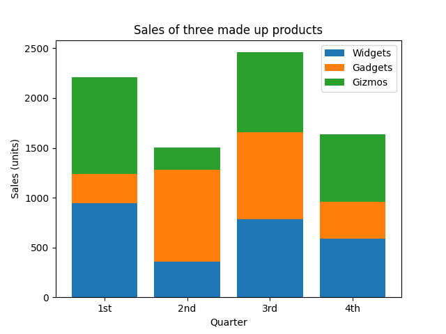
sales = 1000 * rng.random((3,4))
quarters = ['1st', '2nd', '3rd', '4th']
labels = ['Widgets', 'Gadgets', 'Gizmos']
colors = [COLOR_BLUE, COLOR_ORANGE, COLOR_GREEN]
bottom = np.zeros(len(quarters))
for i, product in enumerate(sales):
    ax.bar(quarters, product, label=labels[i], color=colors[i], bottom=bottom)
    bottom += product
ax.set_title('Sales of three made up products')
ax.set_xlabel('Quarter')
ax.set_ylabel('Sales (units)')
ax.legend()
plt.show()
6: Create a 3D scatter plot using three sets of random data points, each containing 100 points with values between 0 and 1. Customize the plot by using a different marker for each dataset, changing the colors, and adding a title and legend.
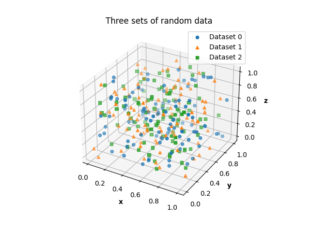
fig = plt.figure()
ax = fig.add_subplot(projection='3d')
fig = plt.figure()
ax = fig.add_subplot(projection='3d')
data = [rng.random((3, 100)) for _ in range(3)]
markers = ['o', '^', 's']
colors = [COLOR_BLUE, COLOR_ORANGE, COLOR_GREEN]
for i, dataset in enumerate(data):
ax.scatter(*dataset, label=f'Dataset {i}', color=colors[i],
marker=markers[i])
ax.set_title('Three sets of random data')
ax.set_xlabel('x', fontweight='bold')
ax.set_ylabel('y', fontweight='bold')
ax.set_zlabel('z', fontweight='bold')
ax.legend()
plt.show()
7: Generate a 10x10 matrix with random values between 0 and 1. Use this data to generate a heatmap. Change the color maps of the heatmap, and add text to each cell of the heatmap to show its associated value, customize the color of the text and center it both horizontally and vertically. Finally, add a colorbar and a title.
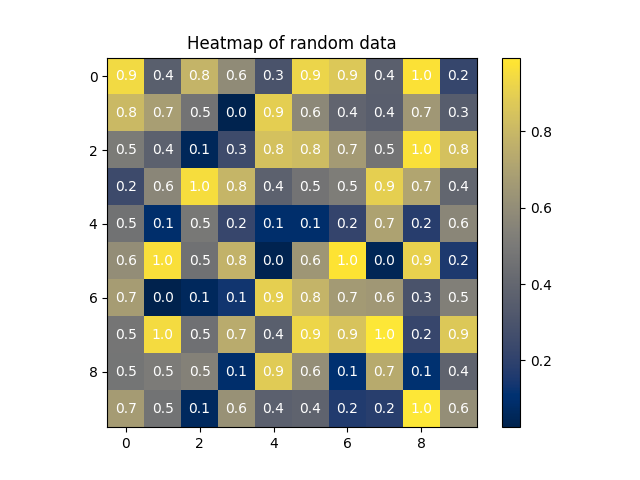
data = rng.random((10, 10))
heatmap = ax.imshow(data, cmap='cividis')
for r in range(data.shape[0]):
    for c in range(data.shape[1]):
        ax.text(c, r, np.round(data[r, c], 1), ha='center', va='center', color='white')
cbar = fig.colorbar(heatmap, ax=ax)
ax.set_title('Heatmap of random data')
8: Plot an Archimedean spiral
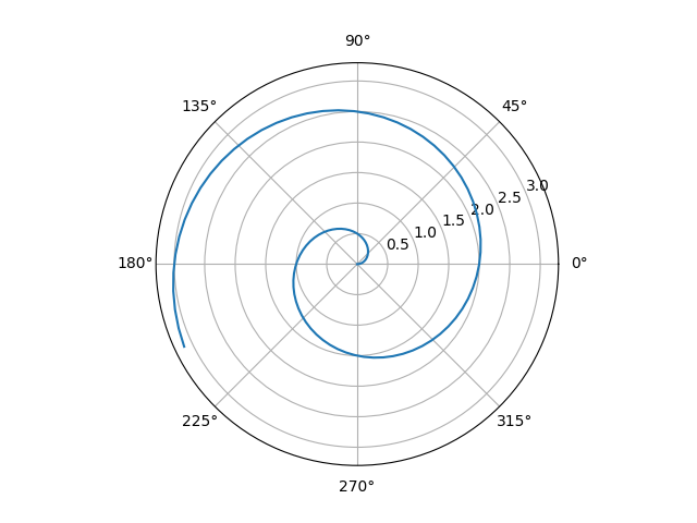
fig = plt.figure()
ax = fig.add_subplot(projection='polar')
r = np.linspace(0, np.pi, num=100)
theta = np.pi * r
ax.plot(theta, r)
plt.show()
9: Generate 100 values of a linear function and 'corrupt' it with random Gaussian noise. Plot these data as a scatterplot. Now using only matplotlib and NumPy, perform a Linear Regression on the data and plot the result (i.e. plot a line of best fit). Calculate the R^2 value of the regression. Add a title, legend, and the R^2 value to the plot, and change the color and style of the line representing the regression.
You will find folks online suggesting numpy.polyfit for a problem such as this, however, the official numpy documentation states:
... the poly1d class and associated functions defined in numpy.lib.polynomial, such as numpy.polyfit and numpy.poly, are considered legacy and should not be used in new code.
So try to find a way to solve this problem without using it (free hint: the documentation page I just linked to points to another method you can use!)
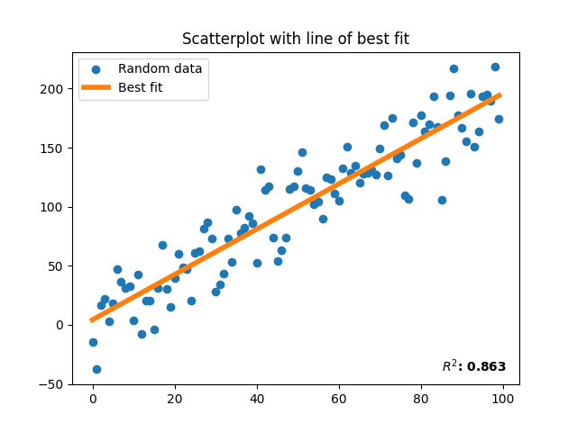
SST = sum((y - np.mean(y))**2)
a = np.arange(100)
b = 2 * a + 1 + rng.normal(scale=20, size=100)
ax.scatter(a, b, color=COLOR_BLUE, label='Random data')
# linalg.lstsq solution ==================================================
# linalg.lstsq performs linear regression by finding the closest solution to
# a @ x = b, where x will be a vector containing our least-squares solution.
# because we need x to be a 100x1 vector, we need to convert a to a nx100
# matrix
A = np.vstack([a, np.ones(len(a))]).T
result = np.linalg.lstsq(A, b, rcond=None)
m, c = result[0]
line_of_best_fit = [m*x + c for x in a]
SSR = result[1]
SST = sum((b - np.mean(b))**2)
R2 = 1 - (SSR / SST)
ax.plot(a, a*m+c, color=COLOR_ORANGE, lw=4, label='Best fit')
ax.set_title('Scatterplot with line of best fit')
ax.text(85, -40, f'$R^2$: {R2[0]:.3f}', fontweight='bold')
ax.legend()
plt.show()
# Polynomial.fit solution ================================================
line, full = np.polynomial.polynomial.Polynomial.fit(a, b, deg=1, full=True)
c, m = line.convert()
SSR = full[0]
SST = sum((b - np.mean(a))**2)
R2 = 1 - (SSR / SST)
ax.plot(a, m*a+c, color=COLOR_ORANGE, lw=4, label='Best fit')
ax.set_title('Scatterplot with line of best fit')
ax.text(85, -40, f'$R^2$: {R2[0]:.3f}', fontweight='bold')
ax.legend()
plt.show()
As a reminder this tutorial is not exhaustive, there are many things you can do that we haven't even touched here (have a look at the examples on the official documentation page for some fun ideas!) However if you've completed this tutorial you should have the foundational skills to visualize data in just about any way you can think of.
Posted: 2023-04-18